Matplotlib
Matplotlib is an integrated python library which aims for creating visualization and graphical representation such as line chart,scatter chart,pie chart,etc. Matplotlib makes easy things more easy and hard things makes possible to do.Matplotlib was developed by Michael Droettboom.It provides an object-oriented API for embedding plots into applications using general-purpose GUI toolkits like Tkinter, wxPython, etc.Matplotlib is a comprehensive library which helps to get integrated visualization and graphical interpretation.We could import the matplotlib library as well as the numpy library by importing numpy as np and matplotlib as plt,respectively.
import numpy as np
import matplotlib.pyplot as plt
Features of Matplotlib
Following are the features of matplotlib library in python :
- Matplotlib is a free and open source and we can use it freely without seeking permissions.
- Matplotib is a graph plotting library which serves as a visualization utility.
- We could get its source code from github repository https://github.com/matplotlib/matplotlib
Usecases of Matplotlib
Matplotlib has various applications in Data Visualization and Graphical Plotting Representation.Along with this.Matplotlib is used for the plottting of Line Graph,Scatter Chart,Pie Graph,Histogram,Bar Graph,etc.

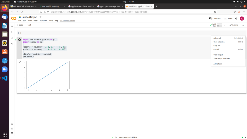
Creating Line Graph with Matplotlib
Matplotlib is commonly used to plot a line graph by using plot() function.
import matplotlib.pyplot as plt
import numpy as np

xpoints = np.array([1, 2, 3, 4 , 5 , 6])
ypoints = np.array([2, 4, 6, 8, 10, 12])

plt.plot(xpoints, ypoints)
plt.show()
The graph obtained will be in the form of straight line :
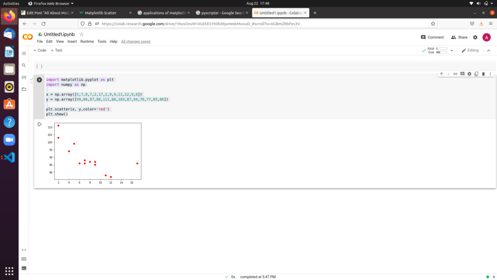
Creating Scatter Chart with Matplotlib
Matplotlib is also commonly used to plot a scatter chart by using scatter() function.
import matplotlib.pyplot as plt
import numpy as np

x = np.array([5,7,8,7,2,17,2,9,4,11,12,9,6])
y = np.array([99,86,87,88,111,86,103,87,94,78,77,85,86])

plt.scatter(x, y,color='red')
plt.show()
The graph obtained will be in the form of points :
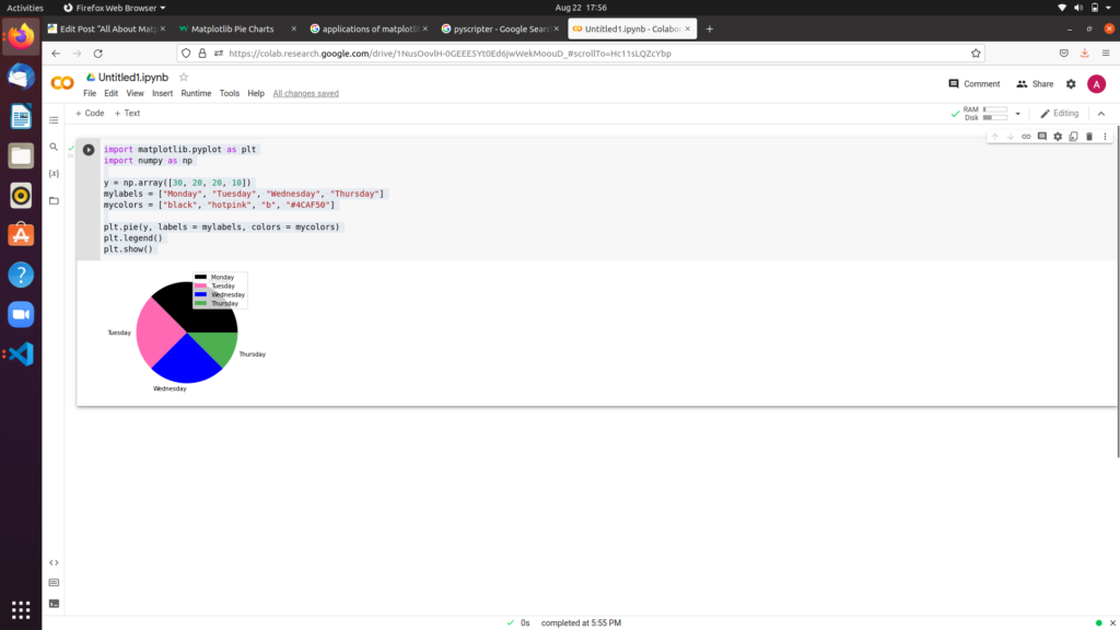
Creating Pie Chart with Matplotlib
Matplotlib is also commonly used to plot a pie chart by using pie() function.
import matplotlib.pyplot as plt
import numpy as np

y = np.array([30, 20, 20, 10])
mylabels = ["Monday", "Tuesday", "Wednesday", "Thursday"]
mycolors = ["black", "hotpink", "b", "#4CAF50"]

plt.pie(y, labels = mylabels, colors = mycolors)
plt.legend()
plt.show()
The graph obtained will be in the form of pie chart :
Creating Histogram with Matplotlib
A histogram is a graphical display of data with bars of different heights, where each bar groups numbers into ranges.It is an approximate representation of distributed numerical data .We could plot histogram with matplotlib by using hist() function which will read the array and produce the appropriate histogram.
import matplotlib.pyplot as plt
import numpy as np

x = np.random.normal(120, 10, 200,)

plt.hist(x,color='black')
plt.show()
The Histogram will be look like:

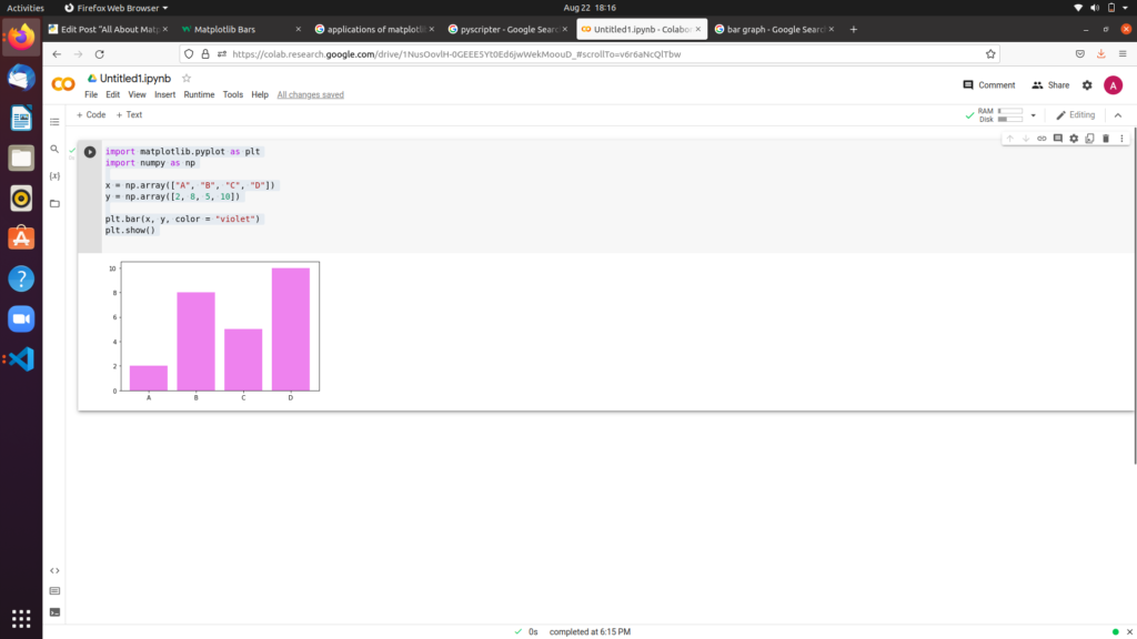
Creating Bar Graph with Matplotlib
Bar graph is the pictorial representation of data in the form of vertical and horizontal rectangular bars where the length of bars are proportional to the measure of data.Bar graph are also known as Bar charts.These bar charts are proved to be very helpful for handling data in Statistics and Business Analytics.
We could plot bar graph with Matplotlib by using bar() function to draw bar graphs
import matplotlib.pyplot as plt
import numpy as np

x = np.array(["A", "B", "C", "D"])
y = np.array([2, 8, 5, 10])

plt.bar(x, y, color = "violet")
plt.show()
The graph obtained will be in the form of either bar graph or bar chart.
.